


We've read all sorts of headlines in the financial press about dropping unemployment figures recently — down to 7% in November 2013, the last data set prior to this story going to press, according to the Bureau of Labor Statistics.
And it’s likely headed even lower since this has gone to press, maybe into 6% territory in December 2013. And pundits are already out in force talking about how the nation’s unemployment rate could fall below 6.5% before the end of 2014.
Happy days are here again! Right? As well-known college football analyst Lee Corso might say: not so fast, my friend.
The uglier truth is that the employment picture remains largely unchanged from where it was in the middle of the nation’s housing and economic crisis. And at the end of this column, you’ll see what reality really looks like — in one simple chart.
Let’s start with the most obvious. A simple equation drives the unemployment rate, after all:
# Unemployed / Size of Labor Force
Understanding how this simple calculation is made means everything in terms of understanding what’s really going on in the nation’s job market.
UNDERSTANDING THE LABOR ECONOMY
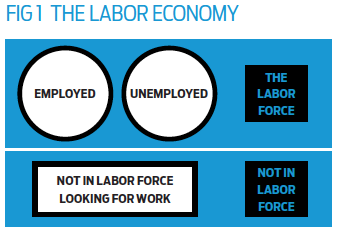
Generally speaking, all individuals fall into one of three mutually exclusive camps: employed, unemployed, or “not in the labor force.”
But how one ends up in which of the three camps is as important to understand as the headline-grabbing employment numbers that get reported each month.
Getting there means first understanding the so-called Labor Participation Rate, which effectively is the percentage of the U.S. labor economy deemed part of the active labor force. In math-speak, it looks like this:
Labor Participation Rate = The Labor Force / (The Labor Force + Not in Labor Force)
The nation’s labor participation rate has tanked in the wake of the Great Recession, as the chart below will show, most recently hovering in the low-60% range.
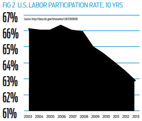 This means more Americans are falling into the “Not in Labor Force” bucket, instead of being included in the Employed or Unemployed bucket; and this skews the nation’s unemployment rate calculation by pulling otherwise unemployed Americans out of the official calculation, artificially decreasing the numerator in the unemployment calculation.
Why is this happening? To some extent, it’s because Baby Boomers are retiring, but that’s not the only reason. People can drop out of the labor force simply because they quit looking for a job; or because it’s been more than 12 months since the last job search — an increasing reality for many U.S. workers in the wake of the recession.
THREE (OFFICIAL) WAYS OF MEASURING UNEMPLOYMENT
The Bureau of Labor Statistics actually releases three different measures of counting unemployment, although only one makes headlines:
- Official unemployment. This rate, called the U-3 by economists, is the simple calculation that drives headlines. Total unemployed divided by labor force. “Unemployed” is defined to mean those without a job, who have actively sought work in the past 4 weeks and are currently available to work — anything else and the individual isn’t part of the labor force as far as this calculation goes.
- Marginally attached unemployment. This rate, called the U-5 by economists, adds in so-called “marginally attached workers,” or those who don’t have a job, are actively looking for work and have worked in the past 12 months. Marginally attached individuals aren’t part of the “official” active labor force and are added back in to calculate the U-5 rate.
- Marginal plus part-time unemployment. This last rate, called the U-6 by economists, takes the previous U-5 rate and also adds in workers who indicate that they’ve taken a part-time job for economic reasons when they’d much rather have full-time work, counting these workers among the unemployed.
The U-5 and U-6 represent efforts to more accurately capture so-called “real unemployment,” especially since so many Americans are experiencing protracted periods of unemployment that extend well beyond the four weeks used in the official calculations.
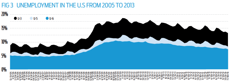 Figure 3 shows how the U-3, U-5 and U-6 rates compare over time: not surprisingly, the U-6 represents the highest rate, most recently standing at 12.7% of the U.S. work force counting as unemployed by that measure in November 2013.
Let’s put that figure into perspective for a minute: 12.7% is definitely better than the 13.9% in U-6 unemployment registered one year ago, yes — but it also remains a far cry from the 10.6% long-term average the U-6 has registered over the past decade.
SO, WHAT’S “TRUE” UNEMPLOYMENT?
While understanding the three unemployment measures above is an important start, many economists argue that we have to go even further to understand the actual jobs picture.
The reason goes back to Figure 2, presented earlier: a steadily falling labor participation rate.
The question is how to best capture which percentage of the labor participation rate dropping is due to actual retirements (Baby Boomers), and how much is due to discouraged workers. Because any estimation of unemployment should try to capture those who have simply dropped out altogether.
One way to do this: look at something called the “labor activity rate,” which captures the active labor market as a percentage of only the working age population (versus the entire population, as is done in calculating the labor participation rate).
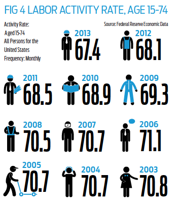
What the labor activity rate shows us is that roughly 3.4% of the working age population in the U.S. has left the active work force since the start of the Great Recession. (In December 2007, the activity rate was 70.75%; at the end of October 2013, the most recent data available when this was published, the activity rate had fallen to 67.39%.)
If we assume that these working-age individuals who once did work, and have since left the work force, want back in — meaning that we assume a labor activity rate of 70.75% of the working age population, instead of the more recent 67.39% labor activity rate — things start to look very, very different.
Further, rather than calculating unemployment as a percentage of the total civilian population — which includes those who have retired and aren’t working age — if we instead calculate unemployment as a percentage of the entire working age population, we can get a clearer read on what “real unemployment” looks like in the U.S.
Figure 5 shows you what happens when you juxtapose “real unemployment” with the headline data.
The result is anything but pretty. “Real unemployment” hasn’t come down at all, when you adjust for the size of the workforce and those who have fallen out of the active workforce.
The “real unemployment rate” hit 13.2% in October 2013, which is actually higher than the 12.4% “real unemployment rate” recorded one year earlier. And it’s pretty clear that after jumping during the recession, real unemployment has yet to come off the range of historical highs associated with that time.
Is it any wonder this economic recovery feels so hollow for so many? The ugly truth is that this recovery is a non-starter for many more Americans than most media reports would have you believe.
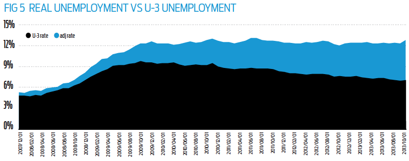 Beyond the raw numbers, the real story here is the comparative gap between the two data series, which tells a fitting story. Notice that as the recession began, while there is a gap between the U-3 and what we’re calling “real unemployment,” that gap remained fairly consistent through mid-2009.
But in mid-2009, something massive changed, and “real unemployment” began its wide divergence from the reported U-3 rate. What happened should underscore the depth of the problems now facing the economy — our labor economy underwent a structural shift that simply can’t be ignored.
In particular, two trends converged: first, Generation Y workers entered into the working age population at a rate faster than the Baby Boomers — hardest hit by the recession — were exiting the workplace. Second, those who had lost their jobs found they couldn’t replace them and many simply gave up on their search.
The result is a “real unemployment” gap that persists to this day and if anything, is only getting wider as job growth fails to keep pace with population growth in the U.S.
Sooner or later, U.S. policy makers will have to come to grips with the reality of the situation in the labor market. The only question that now remains, as far as we can see, is singular: when?
Editor's note: See the data used to calculate "real unemployment" by clicking here.

