A few circles I’m lucky enough to run with have been circulating a recent post from the equity-centric finance blog Zero Hedge that purports to show “negative mortgage spreads.” I’ve seen some breathless commentary around this issue, but before we go and raise our blood pressure, it would benefit everyone — especially equity traders, apparently — to have a quick refresher on mortgage spreads, how they’re calculated, and what they mean. Because without that, you might think the secondary market was facing some sort of imminent crisis, after you decided to graph Fannie Mae current-coupon bonds against something like 30-year Treasuries on your Bloomberg terminal. Let’s start with the anonymous author’s comment on the analysis in question:
The next chart compares the 30 Yr UST with the 30 Yr FN current coupon (MTGEFNCL). Welcome to the bizzaro world of negative mortgage spreads: somehow a 30 year mortgage has become cheaper than US Sovereign debt…Maybe taxpayer subsidies into Fannie/Freddie have something to do with it?
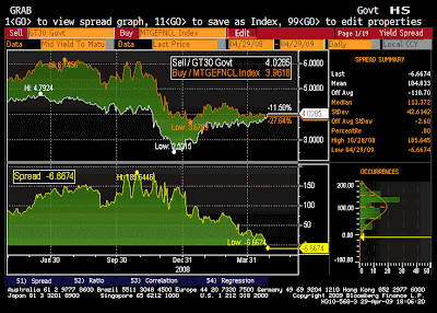
Any mortgage analyst worth their salt — make that any CFA worth their salt, for that matter — should immediately notice what’s wrong with the above analysis: a duration mismatch, and of the most basic and utterly inexplicable kind. Which means the chart is pretty meaningless, as is any sort of speculation that a “negative mortgage spread” is due to taxpayer subsidies. Those of you out there in primary/originator mortgage-land that have seen this and freaked out over it can calm down, and quit emailing this to me. There is no negative mortgage spread. Actual mortgage spreads against Treasuries — “real” mortgage spreads, if you will — are calculated against an interpolated 7.5yr Treasury bond, meaning the prices of the 5 and 10-year notes. The reason here is simple: the duration of an average U.S. mortgage is between 5 and 10 years, due to voluntary and involuntary prepayments for most borrowers. Calculating the spread between two bonds with wildly different durations does little to tell anyone anything about perceived credit risk. In fact, it does little to suggest much of anything at all. Had the author calculated spreads correctly, s/he would have found a far different picture of what’s been going on with mortgages:  The above data is courtesy of UBS, from a dear colleague; it’s an update to a chart we publish each month in HousingWire magazine. “Real” mortgage spreads here have actually been below 150bps since late April — a good sign, and at least resembling their long-term averages over the past 10 years. Does this mean market distress is gone? Of course not, but it does suggest that all of the Fed buying as of late has had a clearly calming effect; the longer-term questions, as of yet unanswered, are how much more does our own government need to buy of our own mortgage securities? And what can be done to bring foreign buyers back into the mix? Both are questions I won’t delve into in this particular op-ed, but it should be clear from the “real” spread chart provided above that at least some parts of the mortgage markets have settled down considerably since the government took over the GSEs last November. Like anything in life, how you see the world is a function of not only the data and tools you have, but how you use them. Write to Paul Jackson at [email protected].